Using the Connector Dashboard
The Connector Dashboard is where you spend your time as a connector. It surfaces the companies and people in your network who can have the most impact on your sales team's pipeline, and it lets you take action — rate a relationship, offer help, or offer an introduction — without leaving the page.
The dashboard has two tabs: Target Companies and My Network.
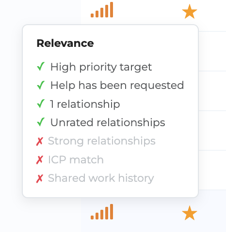
Relevance scoring
Every row on both tabs has a set of signal bars on the left. The more bars filled in, the more relevant the row is to your company's goals right now. Hover the bars to see exactly why something is relevant — ICP matches, help requests, unrated relationships, recency, and more.
By default, both tabs sort by relevance so the most impactful rows are at the top.
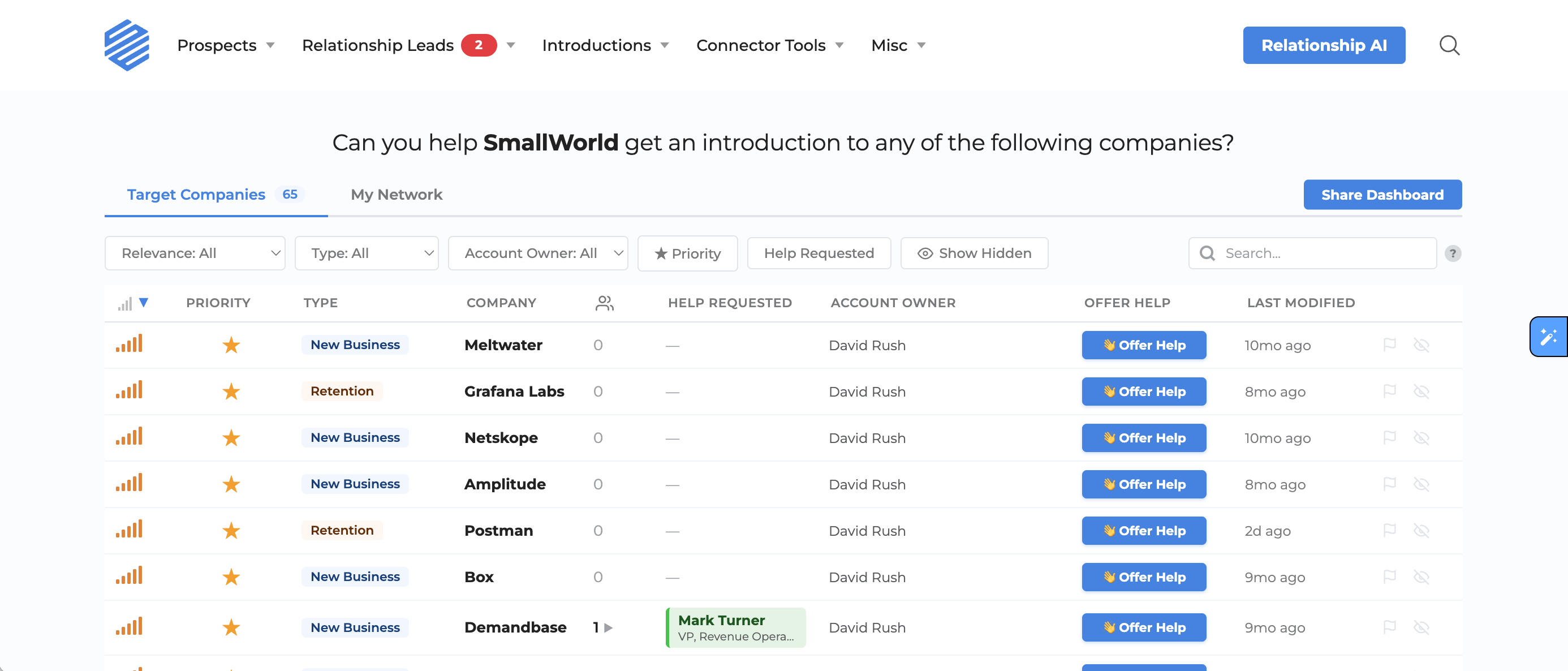
Target Companies tab
The Target Companies tab shows every company your account admins and requesters are pursuing. Each row tells you, at a glance:
- Relevance — the signal bars described above
- Priority — a ⭐ icon marks high-priority accounts
- Type — New Business, Expansion, or Retention
- Company — name, logo, and a LinkedIn icon to jump to the company page
- Relationships — how many people you know at the company
- Help Requested — shows who on the sales team has requested help at that company, so you never miss an open ask
- Details — sales context written by the requester
- Offer Help — a button to offer generic support on the deal
- Date Added — how long the company has been a target
Expand a row to see who you know
Click any company row to expand it. You'll see each person you know there, along with:
- Their title and company
- Your rated strength (or a prompt to rate them)
- An Offer Intro button that opens the introduction flow
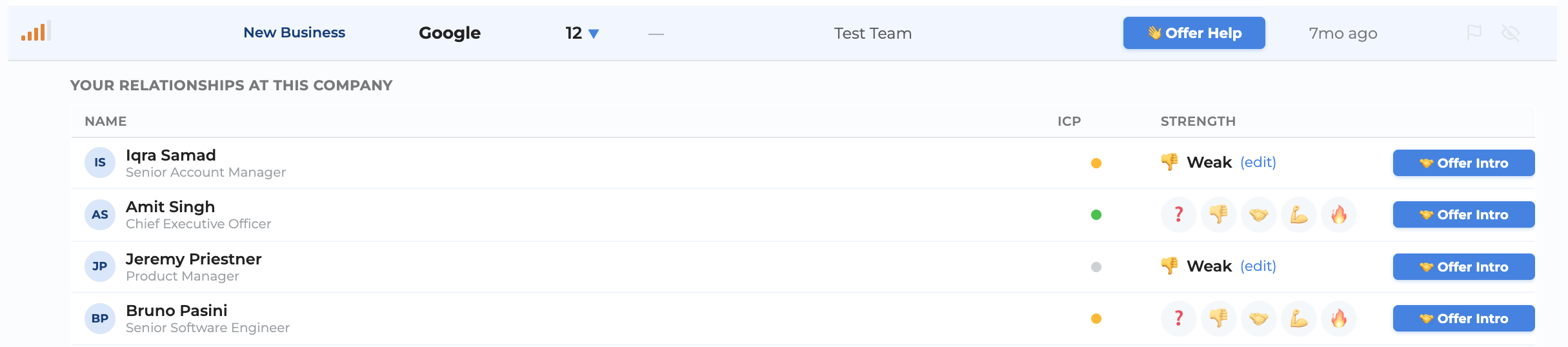
You can rate any relationship in one click — just tap the emoji that matches your strength level. You don't need to rate everyone; focus on the people sales actually needs.
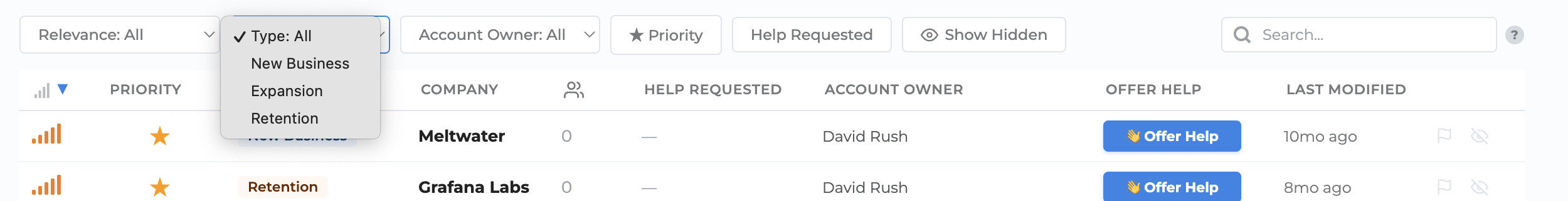
Filters
Use the filter bar above the table to narrow down:
- Priority — only high-priority accounts
- Type — New Business, Expansion, Retention
- Relevance — filter by signal count
- Help Requested — only companies where help has been requested
- Show Hidden — reveal companies you previously hid
Search
The search bar supports both keyword and natural-language search. Click the ? icon in the search bar for examples of what you can ask.
Sorting
Click any column header to sort by that field. Click again to reverse the sort order.
Actions
Two small icons appear on the right of every row:
- Flag — report that a company's data is incorrect. We'll review and remove it from your dashboard.
- Hide — remove the company from your default view. Use the Show Hidden filter to unhide.
My Network tab
The My Network tab shows the people in your network who are most relevant to your company's pipeline — typically people at target companies, in the right buying centers, at the right levels.
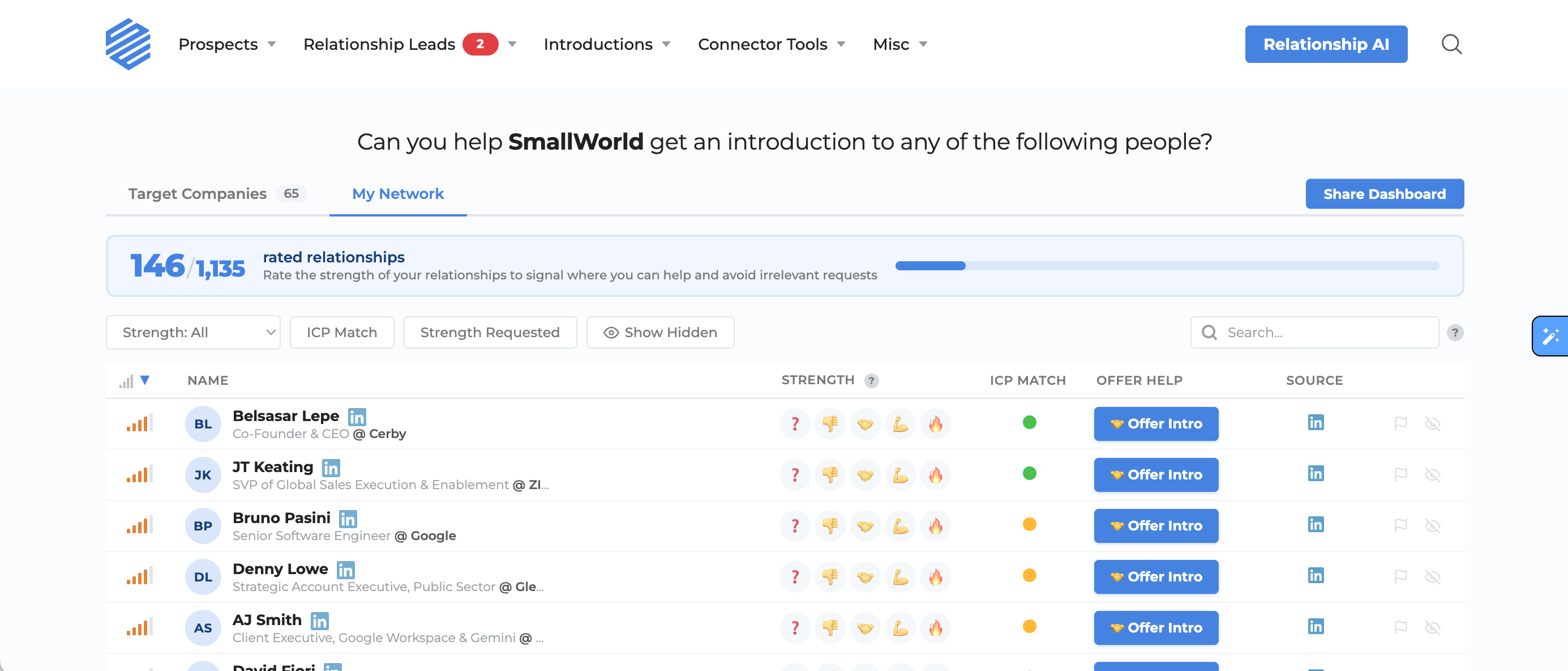
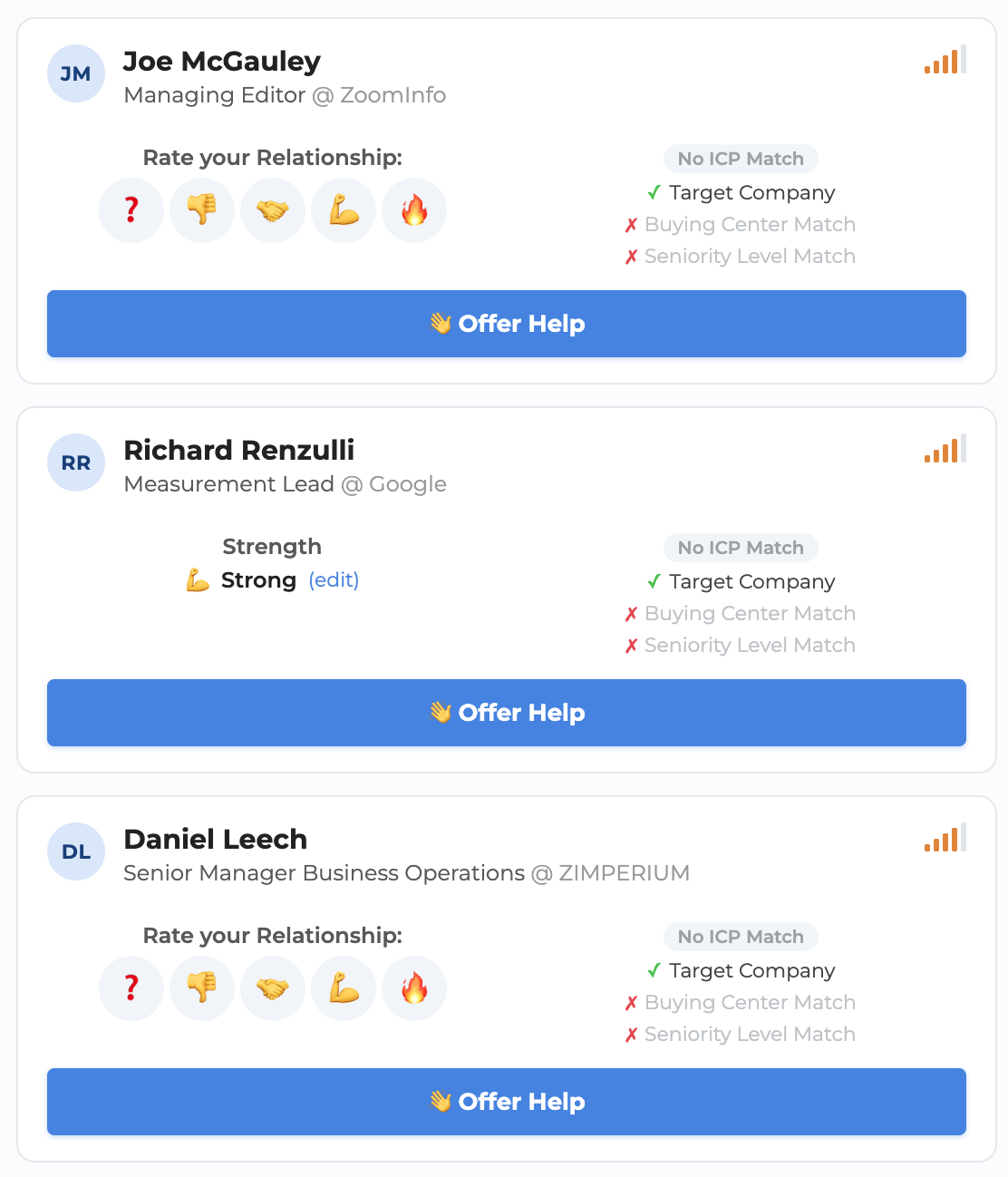
Each row shows:
- Relevance — signal bars
- Name — with profile photo, title, and company
- Strength — the five-emoji rating scale. Click any emoji to rate inline.
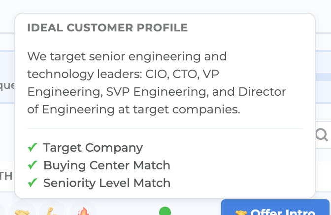
- ICP Match — color dots indicating which parts of your sales team's Ideal Customer Profile this person matches (company, buying center, level). Hover for detail.
- Offer Help — offer generic help with this person
- Source — how SmallWorld learned about this relationship (LinkedIn, Gmail, work history, etc.)
Rating prioritizes your list
As you rate relationships, the dashboard re-prioritizes live. Unrated people get a relevance boost so they surface to the top — once you rate someone, they move down and the next most relevant unrated person takes the top spot. It works like a task list that gets shorter as you go.

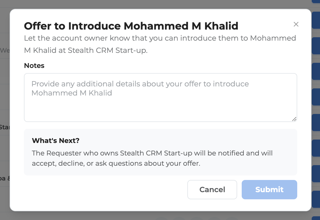
Offer Intro
If you know someone well enough to make a warm introduction, click Offer Intro on their row. This opens the introduction flow where you can choose the requester and send the intro directly.
Mobile and tablet
The Connector Dashboard is fully responsive. On phones and tablets, the table converts to a card layout optimized for touch — you can rate, offer help, offer intros, and expand company relationships just like on desktop.
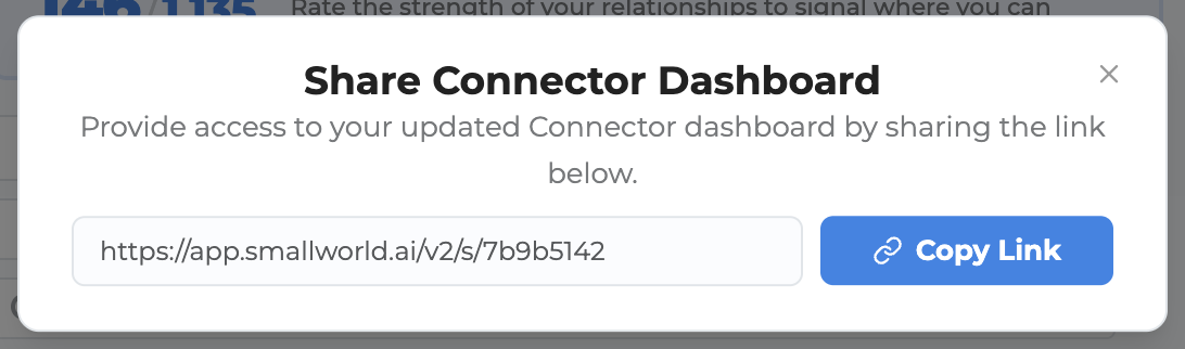
Sharing
Click the Share button at the top of the dashboard to get a shareable link. Others on your team can open it to see the same view you're working from.
Relationship strength
Rating relationship strength is the single most important thing you can do as a connector. See What are the different levels of relationship strength? for what each level means.
Questions
If you have questions about the Connector Dashboard, email us at [email protected].